In this article
Marketing Design for Startups That Makes People Trust You
UI & UX Design
Early-stage companies rarely lose to competitors because their product is worse. More often, they lose because nobody understood what the product does in the eight seconds a visitor spends on the homepage. Marketing design for startups sits exactly at that point of contact: it translates a complex product into something a buyer can grasp, trust, […]

Early-stage companies rarely lose to competitors because their product is worse. More often, they lose because nobody understood what the product does in the eight seconds a visitor spends on the homepage. Marketing design for startups sits exactly at that point of contact: it translates a complex product into something a buyer can grasp, trust, and act on. When budgets are thin and every channel has to earn its keep, design stops being a cosmetic layer and becomes one of the few levers that improves results across the whole funnel at once.
Why Marketing Design for Startups Matters Sooner Than You Think
Founders often treat design as something to “fix later,” once the product is stable and the first round is closed. The problem is that buyers, investors, and candidates form opinions long before that moment. A seed-stage SaaS product with a cluttered landing page, a stock-photo hero image, and three different shades of blue across its ads signals immaturity, even when the underlying technology is excellent. Startup marketing design shapes that first judgment, and first judgments are expensive to reverse.
The good news is that design leverage compounds. A clear visual hierarchy on the homepage lifts sign-ups; the same patterns reused in onboarding lift activation; consistent visuals in ads and emails build recognition that makes every following campaign cheaper. Strong marketing design for startups is less about producing beautiful assets and more about visual consistency: building a repeatable system that makes the company look credible, communicate faster, and convert better with every touchpoint.
Before the Logo: Know Exactly Who You’re Designing For
The most common mistake in startup brand design is opening Figma before the strategy is settled. A logo, a palette, and a typeface cannot fix unclear positioning; they can only amplify whatever message already exists. If the team cannot explain in one sentence who the product is for and why it beats the alternative, the design work will drift toward generic “modern tech” aesthetics that look like every other startup in the category.
Before any visual exploration, it helps to pin down a short positioning brief. It does not need to be a forty-page brand book; one page that the whole team agrees on is enough to steer every design decision that follows:
- Target customer: the specific role, company size, and situation of the buyer, not “SMBs” or “everyone who needs productivity.”
- Core problem: the pain the customer already feels and is actively trying to solve.
- Main alternative: what they use today, whether that is a competitor, a spreadsheet, or a manual process.
- Key differentiator: the one reason to switch that competitors cannot easily claim.
- Brand personality: three or four adjectives that describe how the company should feel, such as “calm, precise, quietly confident.”
With that brief in place, design choices become arguments rather than tastes. A fintech startup selling to CFOs might lean on restrained typography and generous whitespace to signal reliability, while a developer tool can afford dark interfaces, monospace accents, and a more playful tone. Linear is a well-known case of positioning expressed through design: its precise, minimal, dark-themed visual language reinforces the promise of a fast, focused tool for engineering teams before a visitor reads a single feature description.
Start Small: A Visual Identity You Won’t Outgrow by Next Quarter
In marketing design for startups, an early-stage visual identity should be small, flexible, and easy to apply. At pre-seed or seed stage, the company will likely pivot its messaging, sometimes its audience, and occasionally its product. Investing in an elaborate identity with custom illustrations and dozens of brand applications locks the team into choices that may not survive the next six months. A lean identity gives enough consistency to look professional without becoming a sunk cost.
In practice, a lean startup branding kit usually includes a simple wordmark or logo, a primary and secondary color with a few neutrals, one or two typefaces with clear rules for headings and body text, an icon style, and a handful of layout templates for social posts, ads, and slides. That is enough for a founder, a marketer, or a freelancer to produce on-brand materials without asking a designer to approve every banner.
Restraint matters here. Many startups overuse gradients, 3D blobs, and abstract illustrations because they look current, but trends date quickly and make it harder to stand out. A useful test is to place the homepage hero next to those of five direct competitors with logos removed. If it is impossible to tell which one belongs to whom, the visual identity is not doing its job, no matter how polished each element looks on its own.
What a High-Converting Landing Page Does Differently
For most startups, a high-converting landing page is the single most important marketing design asset. Paid ads, cold outreach, social posts, and investor intros all eventually send people to it. Yet landing pages are often designed as brochures, listing features in the order engineers built them, rather than as a guided argument that moves the visitor from curiosity to action.
Every high-converting landing page follows a predictable logic, even though the visual execution varies widely. The page needs to answer the visitor’s questions in the order they arise:
- What is this? A headline that states the outcome for a specific audience, not a vague slogan.
- Is it for me? A subheadline or short line that names the customer and the use case.
- Does it actually work? A product visual, short demo, or interactive preview instead of an abstract illustration.
- Who else trusts it? Customer logos, short testimonials, or concrete usage numbers placed close to the top.
- What do I do next? One primary call to action, repeated consistently, with a low-friction alternative such as “watch a 2-minute demo.”
A typical example from B2B SaaS: a team replaces an abstract hero illustration with a real screenshot of the product dashboard, annotated with two short callouts, and rewrites the headline from a brand slogan into a plain outcome statement. Changes like these rarely require a redesign of the entire site, yet they tend to produce some of the largest gains in demo requests, because visitors finally see what they are buying. Running such changes as A/B tests, even with modest traffic, turns design from opinion into evidence.

Keeping Visual Consistency When Everyone Makes Their Own Assets
As a startup grows past its first few campaigns, visual consistency is usually the first thing to slip. The sales team builds its own one-pagers, a contractor designs a webinar banner with slightly different colors, and the product team ships new screens that do not quite match the website. Each deviation is small, but together they erode the sense of a coherent company. A lightweight design system is the most efficient way to protect visual consistency without hiring a large design team.
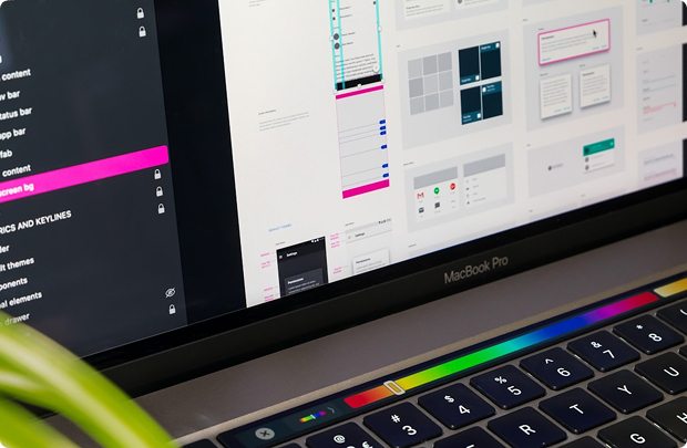
For a startup, a design system does not have to be a sprawling component library maintained by a dedicated team. It can begin as a shared Figma file with color and typography tokens, a set of reusable components such as buttons, cards, and testimonial blocks, and templates for the assets the company produces most often. The aim is to make the right choice the easiest choice, so non-designers can assemble materials that look intentional.
The payoff is speed as well as visual consistency. When a new feature launches, the marketing team can produce a landing section, an announcement email, social visuals, and an in-app banner in a day instead of a week, because most of the building blocks already exist. Shared tokens between the marketing site and the product also make the transition from ad to sign-up to first login feel seamless, which quietly supports conversion and trust.
The First Minutes After Sign-Up Are Marketing Too
Marketing design does not stop at the sign-up button, especially for product-led startups. The moments right after registration, such as the welcome screen, the first empty state, the onboarding checklist, and the first few lifecycle emails, decide whether a new user reaches value or quietly disappears. This is where growth design blends marketing and product thinking.
Empty states are a frequently overlooked opportunity. A blank dashboard with a single “Create project” button gives users nothing to react to, while a pre-filled sample project, a short contextual tip, and a clear next step can dramatically shorten time to value. Notion’s template gallery is a good illustration of this principle: instead of a blank page, new users see concrete examples of what they can build, which makes the product’s flexibility feel approachable rather than overwhelming.
Lifecycle emails deserve the same care as the homepage. They should share the brand’s visual language but stay lightweight: one message, one action, minimal decoration. Many startups find that simple, almost plain-text emails from a founder outperform heavily designed newsletters in onboarding sequences, while richer, visual layouts work better for product updates and feature announcements. Testing both formats against activation metrics is far more reliable than following a generic best practice.
Pitch Decks & Sales Collateral People Actually Read to the End
Investors and enterprise buyers see hundreds of pitch decks and sales collateral pieces every year, and design quality influences how much attention each slide gets. A well-designed pitch deck does not need flashy animations; it needs a clear narrative, one idea per slide, readable charts, and enough whitespace for the key number or claim to stand out. Cluttered slides force the reader to work, and busy readers rarely do.
Sales collateral follows the same logic. One-pagers, case studies, security overviews, and ROI calculators often get forwarded to people who never attended the sales call, such as a CFO, a procurement lead, or an IT reviewer. Each of these documents has to stand on its own, explain the value without a presenter, and look consistent with the website the reader will inevitably visit next.
The practical approach is to treat pitch decks and sales collateral as part of the same design system as the website rather than as one-off projects. Shared templates, consistent chart styles, and a small library of product screenshots allow sales and fundraising materials to be updated quickly as metrics change, without slipping into the visual chaos of slides copied from five different sources.
How to Tell Whether Your Startup’s Design Is Really Working
Marketing design for startups becomes much easier to fund when its impact is visible. Without measurement, debates about design turn into debates about taste, and the loudest opinion usually wins. With clear metrics, the team can prioritize the changes that actually move the business and stop polishing assets that do not matter.
The right metrics depend on the asset, but a compact set covers most startup marketing design decisions:
- Landing page conversion rate: the share of visitors who sign up, book a demo, or start a trial.
- Ad click-through rate and cost per acquisition: a direct signal of how well creative stands out and matches the audience.
- Activation rate: the share of new users who reach the first meaningful outcome in the product.
- Email engagement: click-through rates on onboarding and lifecycle messages, rather than opens alone.
- Sales cycle length and win rate: indirect, but often influenced by the quality of decks and collateral.
Qualitative signals matter too. Session recordings, heatmaps, and five-minute user interviews often reveal problems that numbers only hint at, such as visitors missing the main call to action or misunderstanding a key headline. Combining both views helps teams avoid a common trap: redesigning a page because it “feels dated” when the real issue is a confusing message that no visual refresh can solve.
Three Marketing Design Mistakes Startups Keep Repeating
The first mistake in marketing design for startups is designing for the founders instead of the customer. It is natural to want a brand that reflects the team’s taste, but the visual identity has to speak the language of the buyer. A brand that delights designers on Dribbble may feel cold or confusing to an operations manager evaluating software for a logistics company.
The second mistake is chasing completeness too early. Startups sometimes commission a full brand book, custom illustration set, and complete website redesign before they have validated their message with real customers. A better sequence is to launch with a lean identity, learn what resonates through campaigns and sales conversations, and invest in a deeper brand design once positioning has stabilized, often around a Series A.
The third mistake is sacrificing visual consistency through fragmentation: outsourcing every asset to a different freelancer without shared guidelines. Each piece may look fine in isolation, yet the overall brand starts to look like a patchwork. Even a part-time designer who owns the system, or a small agency on retainer, usually delivers more value than a rotating cast of contributors, because consistency is what turns individual assets into a recognizable brand.
Good Design Won’t Sell for You, but It Makes Selling Easier
Effective marketing design for startups is not about looking expensive; it is about being understood quickly and trusted early. Positioning gives design its direction, a lean visual identity gives it visual consistency, a high-converting landing page and thoughtful onboarding turn it into conversion, pitch decks and sales collateral carry it into fundraising and deals, and a lightweight design system lets a small team keep up with a fast-moving business. Each layer builds on the previous one, which is why disciplined, strategic design often outperforms bigger budgets spent on scattered creative.
For founders and marketing leads, the practical takeaway is to treat design as an ongoing growth function rather than a one-time project. Start with clarity about the customer, invest first in the assets closest to revenue, such as a high-converting landing page, measure what changes, and expand the brand only as fast as the business learns. Startups that approach design this way end up with more than attractive visuals: they build a brand that explains itself, earns trust at every touchpoint, and makes each new campaign a little more effective than the last.
Author