In this article
Website redesign: why 80% fail and what actually drives growth
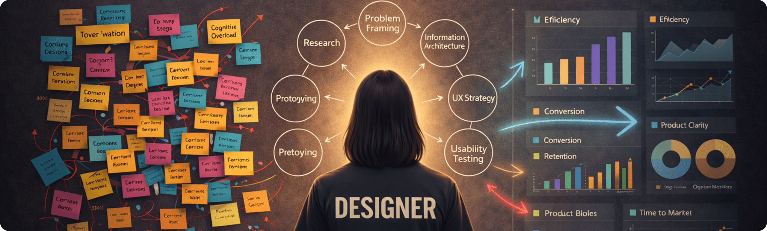
UI & UX Design
Apr 24, 2026
10 min read
80% of website redesigns fail. Not because of poor execution, but because companies treat a structural problem as a visual one. This guide covers what actually drives redesign failure, what the data says about ROI by approach, and how to run a redesign that changes metrics, not just pixels.

Most companies come to redesign with a simple request.
“Our website looks outdated. We want to refresh it.”
Sounds reasonable. Visual styles age. Markets shift. Competitors start looking sharper.
But once you dig deeper, the real picture emerges.
Important information is missing, which quietly erodes trust. The mission no longer resonates with clients, partners, or the internal team. The website fails to communicate the character of the brand, so users never feel a connection.
A website is not a banner. It is not a promotional surface. It is the space where users decide whether they feel confident, understood, and comfortable enough to move forward. It should help people make decisions, not create hesitation.
And the website is not only for clients. It is often the first point of contact for partners, investors, and potential employees. In a reality where decisions happen fast, very few people analyze deeply. People scan, feel, form an impression, and move on.
This is why companies that understand how they present themselves win. Not because they chase trends, but because they understand that perception is emotional before it becomes rational.
Why Redesign Actually Happens
Redesign rarely starts with a desire to change colors or update fonts.
More often, it starts with a deeper feeling that the company has grown or changed, while the website stayed at an earlier stage. Founders usually notice this through consequences.
Conversion drops.
Users visit the site but do not interact.
Partners do not stay long.
Strong products fail to turn into real inquiries.
Behind the word “redesign” there is often a deeper shift. Company reorganization. A change of focus. New services. Entry into a new market. Or simply a moment when the business realizes it no longer wants to look the way it used to.
At this stage, many companies have already paid a price. Time was spent. Budgets were invested. Redesigns were launched. But the result did not change much. The website may look cleaner, yet metrics stay flat. Leads do not grow. Users still hesitate.
This is the most common pattern in the industry. According to research from SoftwareReviews and Info-Tech Research Group, up to 80% of website redesigns fail to achieve their maximum potential. Not because of poor execution, but because of a fundamental disconnect between business goals and user needs.
The problem was never visual. It was structural.

When redesign becomes rebranding
One common trigger for redesign is a change in positioning. A company that once presented itself as a simple service provider may now operate as an expert platform or a solution for complex challenges. The old website simply cannot communicate that shift.
Take a logo as an example. Over time, it may become outdated not visually, but conceptually. A company becomes more dynamic, more technical, more expert, while the logo continues to communicate old associations. Users read this instantly, even if they cannot consciously explain it.
Innovation plays a role as well. Today, many companies integrate AI, automation, and new technological capabilities. If the website does not reflect this shift, a gap appears. Users do not feel innovation, even if it exists inside the product. This is a core part of any UI/UX design service engagement: making internal change visible.
Redesign is not a reaction to trends. It is a response to internal change. When those changes are not communicated through the website, they remain invisible.
How Users Perceive a Website: Design Speaks Before Words Do
When a user lands on a website, the company has not said a word yet.
But the design already has.
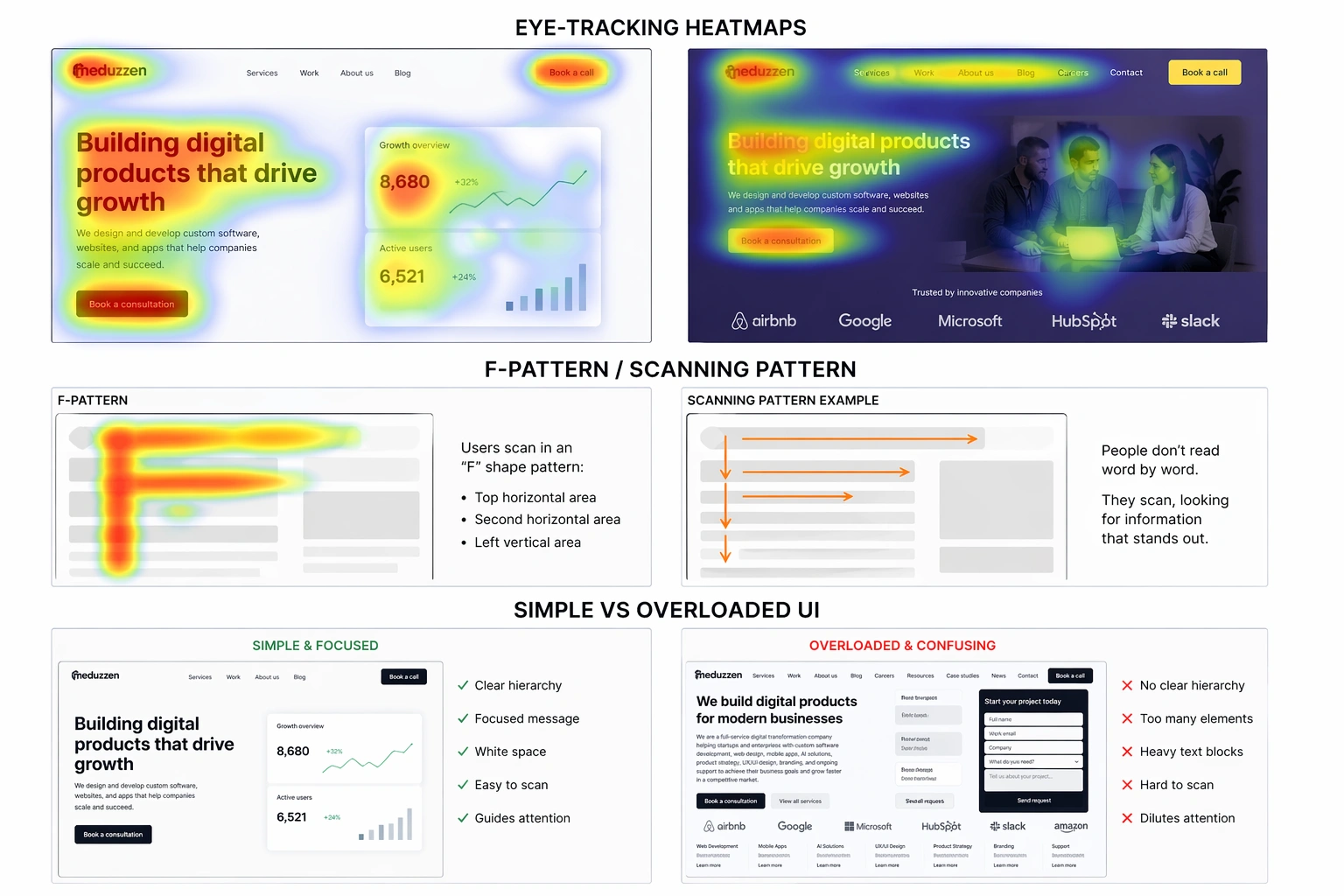
Research confirms just how fast this happens. A foundational study by Dr. Gitte Lindgaard at Carleton University demonstrated that users form aesthetic and credibility judgments within 50 milliseconds. Google’s own research confirmed this threshold and identified two critical factors driving the reaction: visual complexity and prototypicality. The simpler and more familiar the design, the more favorably it is judged.
This means users do not read first. They scan. They notice colors, typography, spacing, balance, and composition. An impression forms before conscious understanding.
A British study led by Dr. Elizabeth Sillence at Northumbria University found that when users rejected a website, 94% of the time it was due to design factors: complex layouts, poor navigation, inappropriate use of color. But when users actively trusted a site, the reasons were predominantly content-related.
The insight here is critical. Visual design functions as a defensive mechanism. It prevents immediate rejection. Content functions as the offensive mechanism. It builds lasting trust and drives conversion. You need both, but design comes first because users never reach your content if the first impression fails.
Eye-tracking research from Missouri University of Science and Technology mapped exactly where attention goes in those first seconds. Users spend more time orienting themselves via the logo (6.48 seconds) and navigation menu (6.44 seconds) than reading actual written content (5.59 seconds). If the information architecture is flawed, the messaging strategy is irrelevant. It will never be consumed.
Even typography sets the tone before any text is read. The same message presented in different fonts creates completely different associations. Colors work the same way. Warm palettes can create trust and stability. Cold tones emphasize precision and technology.
What matters most is the aftertaste. How the user feels after leaving the website. What emotion remains. People rarely remember details, but they remember how something made them feel. This is why website design directly affects trust, willingness to engage, and readiness to take the next step.
Why Cosmetic Redesigns Fail: The Data
The evidence is clear. Surface-level visual refreshes produce negligible returns, while structural overhauls drive direct business growth. The data below breaks down website redesign ROI by approach type:
Data analyzed across redesign projects shows a stark difference in outcomes depending on the scope of the website redesign strategy:
| Redesign Type | Typical ROI | Timeframe |
|---|---|---|
| Visual refresh only (colors, fonts, layout) | +9% | 12 months |
| UX and conversion-focused redesign | +41% | 6 months |
| Full strategic redesign (structure, content, UX, SEO) | +68% | 3 to 9 months |
Source: KrishaWeb analysis of redesign ROI benchmarks, 2026. Individual results vary based on baseline performance, traffic volume, and industry.
The pattern repeats across industries. McKinsey’s Design Index, which tracked 300 publicly listed companies over five years, found that top-quartile design-led companies achieved 32% higher revenue growth and 56% higher total return to shareholders compared to their peers. A deliberate website redesign strategy is the differentiator.
And companies that treat design as decoration? They join a long list of cautionary tales.
Tropicana (2009): Invested $35 million to replace iconic packaging with a “modern” design. Sales dropped 20% within two months, costing approximately $30 million in lost revenue. The company reverted within weeks.
Marks & Spencer (2014): Spent £150 million and two years on a complete website overhaul. Online sales dropped 8.1% in the first quarter after launch. Users could not log in, could not navigate, could not find products.
Digg (2010): Redesigned to prioritize publisher content over community features. Traffic dropped over 50%. Reddit’s traffic surged as users migrated. Digg, once valued at over $160 million, was sold to Betaworks for $500,000 in 2012.
Snapchat (2018): Rearranged the entire interface to separate social from media content. 83% of App Store reviews for the update were one or two stars. Over 1.2 million users signed a Change.org petition demanding a rollback. Snap lost $1.3 billion in market value within days.
In each case, the redesign prioritized what the company wanted over how users actually behaved. The lesson is the same every time. A website redesign that ignores user psychology and structural logic will destroy value, not create it.
Where Redesign Should Actually Start
Redesign never starts with layouts. And it definitely does not start with choosing colors.
A successful website redesign strategy starts before any layout is touched. Before structure, navigation, and visual solutions, there must be a pause to ask the right questions.
What should the website make users feel?
What emotion should appear in the first seconds of contact?
What should remain after interaction?
What associations should the brand evoke in one, three, or five years?
Does this match who the company truly is today?
These questions may seem abstract, but they shape the entire website redesign process. Without them, redesign turns into a cosmetic exercise that looks fresh but changes nothing.
The “just make it look modern” trap
There is routinely a massive gap between what the leadership team believes the website communicates and what users actually perceive. Internal teams suffer from the curse of knowledge. Because a founder knows intimately what their software does, they can navigate a confusing architecture and unconsciously fill in the gaps. A first-time visitor cannot.
This perception gap leads directly to the most dangerous executive mandate: “Just make it look modern.”
When conversion rates decline, the CEO assumes the site looks dated. They hire a team to apply new typography, updated color palettes, and trendy animations. But if the root problem is a convoluted information architecture, an opaque pricing model, or an excessively long form requiring eleven fields, applying a modern aesthetic is painting a condemned house. The website redesign process starts with structure, not style. The fundamental conversion bottleneck remains untouched, and the website redesign ROI is zero.
Structure before style
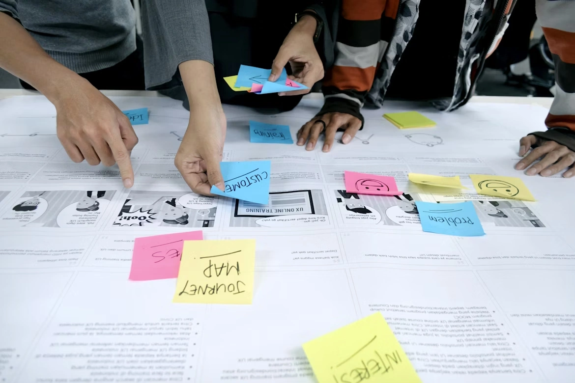
Next comes the structural work. Competitor analysis. User scenario mapping. Navigation audit.
At this stage, gaps become visible. Overloaded navigation. Unclear value propositions. Information scattered across pages, forcing users to hold too much in memory.
This is where cognitive psychology enters the picture. Hick’s Law states that decision time increases with the number and complexity of choices. Redesigns that fail often add massive drop-down menus and competing calls-to-action. Strategic redesigns ruthlessly prune choices to accelerate the buyer’s journey. Miller’s Law reminds us that human working memory holds roughly seven items at any time. Presenting sprawling feature lists or hyper-segmented categories exceeds that capacity and drives abandonment.
On one recent project, the website contained a large number of informational pages. Analysis showed these pages overloaded navigation and complicated the user journey. One menu item in the header contained three words. The user had to stop, read, and interpret. A small detail, but repeated many times, such details create interface fatigue.
We shortened labels, clarified definitions, and simplified navigation. Several pages were merged into one. The information architecture became clearer. Cognitive load decreased, and the sense of control increased.
Speed and simplicity matter more than ever. Users want quick answers and minimal effort. Texts, labels, and flows must be concise. In one B2B e-commerce project, long forms discouraged users before they even started. We split one long form into two steps. The process felt simpler and more manageable. The same applied to product catalogs. Important information was visible at all times. Nothing had to be remembered.
This is classic UX. The interface supports users instead of demanding effort.
To put this in financial terms: in B2B SaaS, the average website conversion rate is just 1.1%. An increase from 1% to 2% through a structural redesign mathematically halves customer acquisition cost for all digital channels. It doubles the yield of existing ad spend without increasing the media budget. That is the difference between a cosmetic refresh and a strategic redesign. One looks better. The other changes unit economics.
After analytics and structure, we move to working with perception. Typography that communicates character. Colors that work with emotion. Visual elements that reinforce meaning rather than decorate it. Several concepts are developed, and only after alignment does visual design begin.
The AI Angle: Why This Matters More in 2026
There is one more reason why a clear website redesign strategy has become urgent in 2026. In 2025 and beyond, B2B buyers increasingly use AI agents to conduct initial vendor evaluations. If a website relies on visual treatments like text embedded in images, or lacks a clean semantic HTML hierarchy, the AI agent simply cannot interpret the value proposition.
Gartner’s 2026 research now shows 67% of B2B buyers prefer a completely rep-free buying experience. The website is no longer marketing collateral. It must function as the primary sales engineer.
The danger of an unstructured site in the AI era is the deal you lose without knowing it existed. The buyer never saw your name. The AI agent reviewed your digital footprint, found the signals too thin to recommend, and quietly moved on. No form fill. No bounce in your analytics. Just a deal that happened without you.
Cosmetic redesigns fail the AI evaluation test. Structural, data-rich, semantically organized redesigns pass it.

What Changes After a Strategic Redesign
After redesign, companies move out of noise.
Clarity replaces chaos.
The website stops being a collection of screens and becomes a coherent story. Users no longer wander randomly but follow a clear and understandable path.
The first noticeable change is message clarity. The website clearly communicates who you are, what you do, and why you can be trusted. This works not only for clients, but also for partners, investors, and potential employees.
The second major shift is UX. Redesign is not UI for the sake of UI. It is about usability, structure, and navigation that does not require effort. In practice, this means shorter flows, simpler forms, and clearer decisions. Well-executed redesigns deliver 20% to 50% conversion lifts within six months, with average payback periods of four to fourteen months.
The third change is user behavior. When a website is logical and comfortable, users stay longer. They explore, read more, and interact naturally.
Redesign also creates brand aftertaste. The feeling that remains after interaction. This feeling determines whether users remember you later. Design without intention is like food without flavor.
Finally, redesign is about longevity. A website is not built for one year. It should work for five to seven years. That is why design cannot rely on trends alone. A well-designed website does not age quickly and continues to reflect the company’s vision over time.

The Right Process: Growth-Driven, Not Big Bang
The traditional website redesign process is a waterfall methodology. Spend six to twelve months building in a vacuum. Launch everything at once. Leave it untouched for three years until it breaks again. This website redesign process fails 49% of the time, with projects never launching or missing deadlines entirely.
The alternative is Growth-Driven Design, which applies agile principles to website development. Growth-driven design replaces the big-bang launch with a continuous improvement cycle:
Phase 1: Strategy and research. Deep user audits, baseline metrics, buyer journey mapping, and content strategy. This is where the hard questions get answered.
Phase 2: The launch pad. A functional, structurally sound baseline site that is an objective improvement over the existing one. Launched in four to eight weeks, not months.
Phase 3: Continuous improvement. Using live user data (heatmaps, conversion metrics, A/B testing) to iteratively refine the site over the next eleven months based on actual behavior, not executive assumptions.
Teams using growth-driven design report 16.9% more leads and 14.6% more traffic after six months compared to the traditional model.
One critical detail: content strategy must precede visual design. Designing with placeholder text guarantees layout breakdowns when real copy arrives. High-performing teams finalize the narrative flow, technical specifications, and keyword targeting before a single pixel is arranged.
Preserve SEO or pay the price
The silent killer in most website redesign projects is not visual backlash. It is SEO migration failure. When URL structures change without proper 301 redirects, when internal linking architectures get flattened for visual simplicity, the site hemorrhages organic traffic. Even light redesign updates can result in a 10% to 25% organic traffic drop if redirects are not mapped precisely.
WooCommerce learned this in 2023 when migrating from WooCommerce.com to the shorter Woo.com. The rebrand triggered a massive search visibility drop, forcing the company to partially retreat. The new homepage loaded beautifully. Internal QA showed all green. But long-tail organic traffic bled out over sixty days because the redirect architecture was broken underneath.
Every strategic redesign must include a pre-launch URL audit, a 1-to-1 redirect map, metadata preservation, and a strict limit on redirect chain depth. Without this, you can build the most beautiful website in the world and still lose half your traffic.
Recognize digital debt before it compounds
Much like technical debt in software engineering, “digital debt” occurs when organizations accumulate UX compromises, legacy integrations, and fragmented content strategies over multiple years. Instead of undertaking a strategic rebuild, companies patch problems by bolting new landing pages, plugins, and contradictory messaging onto an aging CMS.
Eventually, the recurring costs of managing this debt (higher maintenance, lost conversions, manual sales interventions, security vulnerabilities) far exceed the capital expenditure required to rebuild entirely. Recognizing this tipping point is a leadership decision, not a design decision.
Frequently Asked Questions
80% of website redesigns fail to reach their full potential because companies treat the problem as visual when it is structural. Misalignment between business goals and user needs, skipping pre-redesign research, and launching without baseline metrics are the most common causes.
Key signals include declining conversion rates despite stable traffic, high bounce rates, sales team complaints about inbound lead quality, competitor websites that look and function significantly better, and a website that no longer reflects your current services, positioning, or brand identity.
A refresh updates visual elements like typography, colors, and images without changing the underlying structure. A redesign overhauls the information architecture, user flows, content strategy, and navigation logic. Refreshes address appearance. Redesigns address performance.
Using a Growth-Driven Design approach, the initial launch pad can be live in four to eight weeks. Full optimization cycles continue for six to twelve months after launch, using real user data to drive improvements.
In the first 30 days, track technical stability: page load speeds, Core Web Vitals, mobile responsiveness, 404 errors. From days 31 to 60, monitor engagement: heatmaps, bounce rates, time on page. From days 61 to 90, measure conversion trends. After 90 days, calculate aggregate ROI against the pre-redesign baseline.
Most businesses benefit from a strategic redesign every three to five years, with continuous optimization in between. If your business model, positioning, or market has shifted significantly, the timeline may be shorter.
Where This Leads
If you recognize yourself in this situation, if your website has already gone through updates but results did not change, it is not a sign to polish it again. It is a sign to step back and rethink the foundation.
Redesign is not a cost. It is a growth point.
At Meduzzen, our UI/UX team operates as a design studio within a full-service software company. We do not decorate interfaces. We ask the right questions, audit the structure, map user behavior, and build websites that communicate clearly, convert consistently, and last.
If you are ready for a redesign that changes metrics, not just pixels, let’s start the conversation.